Blending Inkscape and Blender

One of the things I’ve always wanted to do is to work on an image in a 3D environment but then export the resultant image to an svg. Being the open source nut that I am my main weapons of choice are Blender for 3D work and Inkscape for vector. These programs have their advantages and their disadvantages. The main advantage they have over many similar programs is that they’re open source and free. They’re very capable products and are used quite widely and are being actively developed. In fact, Inkscape is getting ready to release version 0.47 (I’ve used a prerelease and it’s awesome)

For my task of exporting 3D models to SVG Blender falls slightly short because it doesn’t natively support this. There are a few plugins that have attempted to offer this and do well, but sometimes crash or give unexpected output. That, and for some users going through the hassle of finding the plugin might be too much.

The disadvantage Inkscape has is it’s handling of lots of nodes. The moment you hit around 10,000 nodes the program begins to noticeably slow down. For most simple logo work this isn’t a problem, but when you come to illustration and highly detailed artwork it gets in the way. This was the main thing stopping me from using the SVG that can be generated from Blender. To test it yourself, import an SVG into Blender and then export it as an SVG using either Pantograph or VRM. You’ll notice that it is now made up of about several hundred smaller shapes.

Before Import to Blender: 11 Objects, 124 nodes

Before Import to Blender: 11 Objects, 124 nodes

inkscapeblendertext

After Blender import: 2264 objects with 6792 nodes

This makes colouring or modifying the shape really hard. Sometimes, in Inkscape you can just highlight all of the shapes, go to Path > Union (Ctrl + Shift + +) to combine them all but sometimes it makes it all disappear.

Luckily there is a technique to get this to work. If you import an SVG be sure to apply the Ninja Decimate modifier to the shape and drag the Ratio slider down (thanks to heathenx for this tip). Please note that this only work if you shape is a mesh, so hit Alt + C and convert your shape to a mesh.

If you’re working with text you may notice that after you’ve applied the Decimate modifier and dragged the slider down all of your text looks… crap.

screenshot_15_01:24:52

This is because the modifier is treating the text as a whole shape and thus reducing the face count of the whole combine shape rather than treating each character as an individual shape. You need to separate them. To do this, in Edit mode (hit TAB to get there) hit P (don’t do this in normal mode. It runs the Blender game engine and will most likely crash Blender).

Separate menu

Separate menu

From the Separate menu choose All Loose Parts and now each character is an individual shape. Now, if you run the Decimate modifier on each individual character you have a lot more control over its final appearance.

After Modifications: 324 objects, 972 nodes

After Modifications: 324 objects, 972 nodes

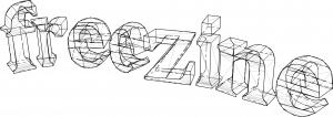
I exported the text to an SVG using VRM but you can do so using that script, Pantograph or the 3D Polyhedron extension in the Render extension menu in Inkscape. Here’s another render showing exactly why you might want to go through this procedure:

70 objects, 36601 nodes

70 objects, 36601 nodes

After basic modification (text from an upcoming project)

After basic modification, 4042 nodes (text from an upcoming project)

The Decimate modifier has its limits. Where a human would simply combine two big triangular faces into a rectangle the modifier sometimes misses this and just over-complicates things and sometimes completely destroys a shape. This is where I ask the Blender community for assistance. Is there a script to easily reduce the face count of an object?

I think native SVG export is something that Blender should work towards in the future. There’s just too many possibilities and opportunities!

Inkscape tutorial: text manipulation

I’ve been messing around with Inkscape a lot recently and have found a few cool tricks. This all originally started as an attempt to recreate an effect I saw on the Inkscape website but quickly evolved into something different.

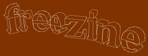
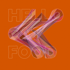
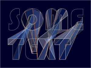
Here’s an example of the output I achieved.

Something I did earlier

Something I did earlier

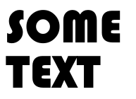
What’s interesting about this is that it’s mostly the work of filters. For this tutorial we’ll be working with text in Inkscape 0.47pre0. To illustrate things better use a font that is very think. Even Arial Black will do. Create two different text objects

The original unmodified text

The original unmodified text

The manipulations we’re going to apply to this text will be affecting paths, so we need to convert this text to a path. To do this go to either Path > Object to path or press Ctrl + Shift + C. This separates the text into individual paths as a group. Ungroup them (Object > Ungroup or Ctrl + Shift + G) and then combine them as a single path using Ctrl + K. Next, position the text wherever you want it.

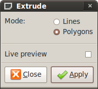
We want to create an extrude between to the two paths. For this you need two separate paths (you created these when you created the text). Click on both of them and then go to Extensions > Generate from path > Extrude.

Extrude window

Clicking on Lines will attempt to link each node of one path to the node of another path with just lines, whereas clicking Polygons will do something similar but link them with shapes. Click on Polygons then press Apply.

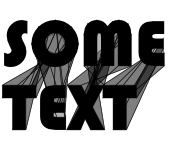
Text with extrude effect applied

Text with extrude effect applied

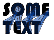
With the new polygons selected pick a hue for it. The reason I specify hue is because we’re going to be modifying the colour next and the filters we will be using will work with the current hue and modify it. As far as I’m aware it can’t modify shades i.e. black or white.

Colour on the extrude effect

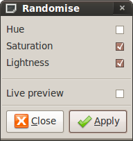
Click on Extensions > Color > Randomise.

Randomise extension window

Randomise extension window

From this window you have several choices. Randomising the Hue lets you have random colours. Randomising the Saturation will randomise the saturation i.e. if it’s a very vibrant colour or slightly dull. Randomising the Lightness will randomise the brightness i.e. if it is completely bright it will go white, if not it will go black. For this I recommend randomising the Saturation and Lightness. To get a preview of the output check the Live Preview option. If you’re not happy with the combination they’ve given you uncheck then recheck the Live Preview. Press Apply when you’re done.

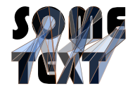
Finished text

For a finishing touch add a background and change the stroke colour

Completely finished!

Completely finished!

Voila!

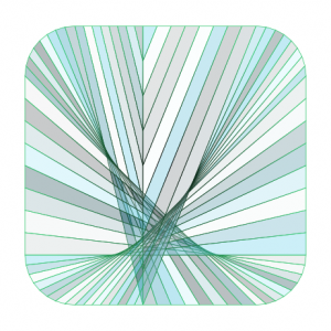
What else can be done with this effect? Well, you know that you need two different objects for this to work, so why not work with one object but then split it into two. In the example below I split a rounded square into two shapes then repeated this procedure.

Stained glass square

Stained glass square

One thing to note is that the more nodes you have the more polygons that will be created

I hope this tutorial has been useful. To extend this try messing around with the Jitter Nodes effect under Generate from Path 😉 For more of my experiments feel free to check out my flickr stream.